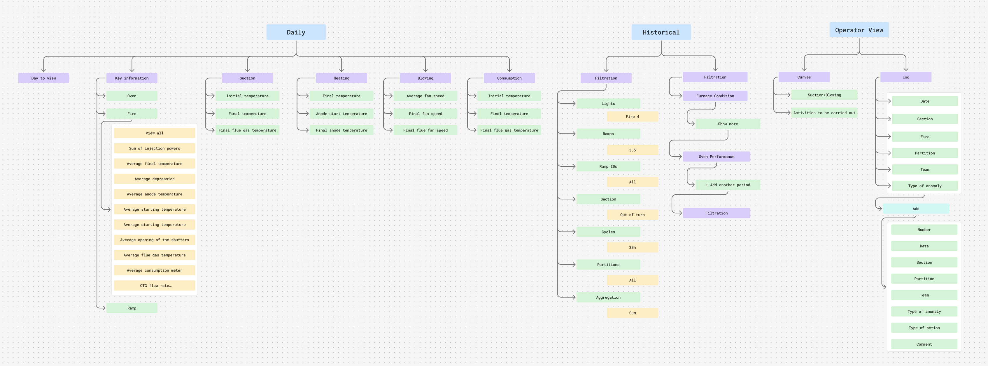
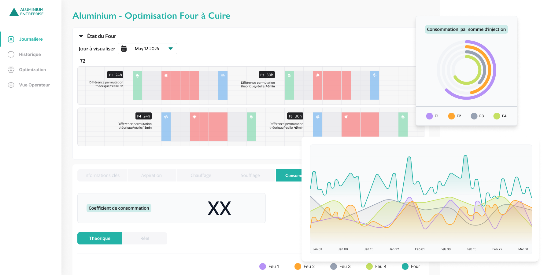
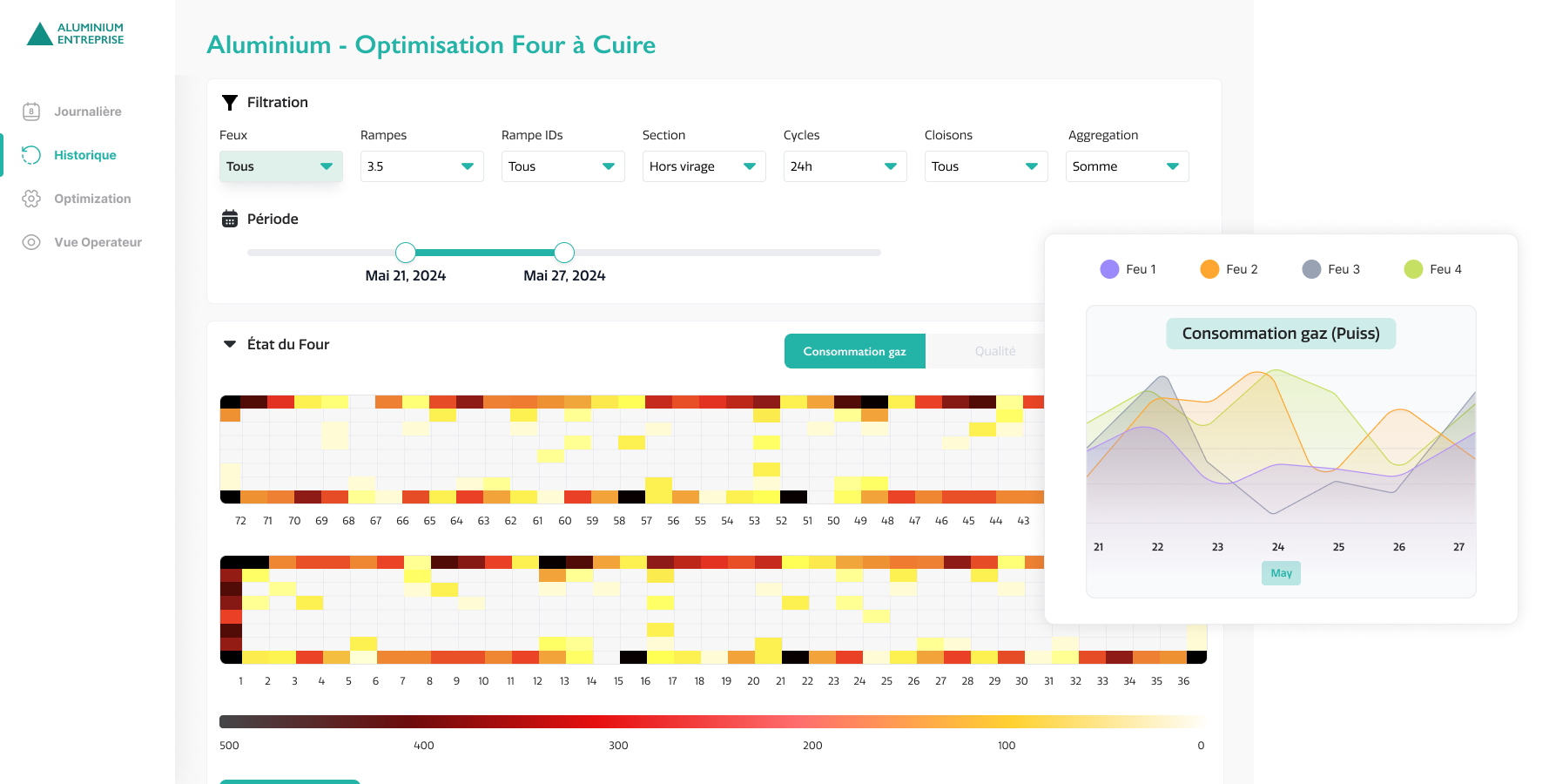
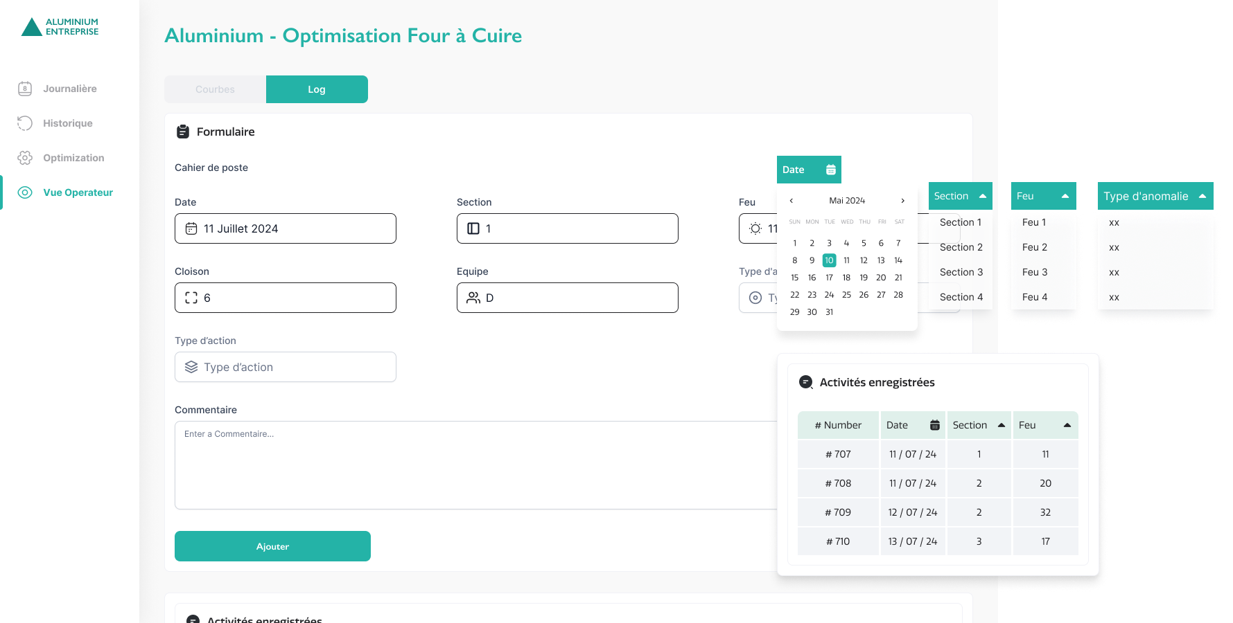
Aluminum Enterprise
Making industrial oven performance transparent, measurable, and manageable
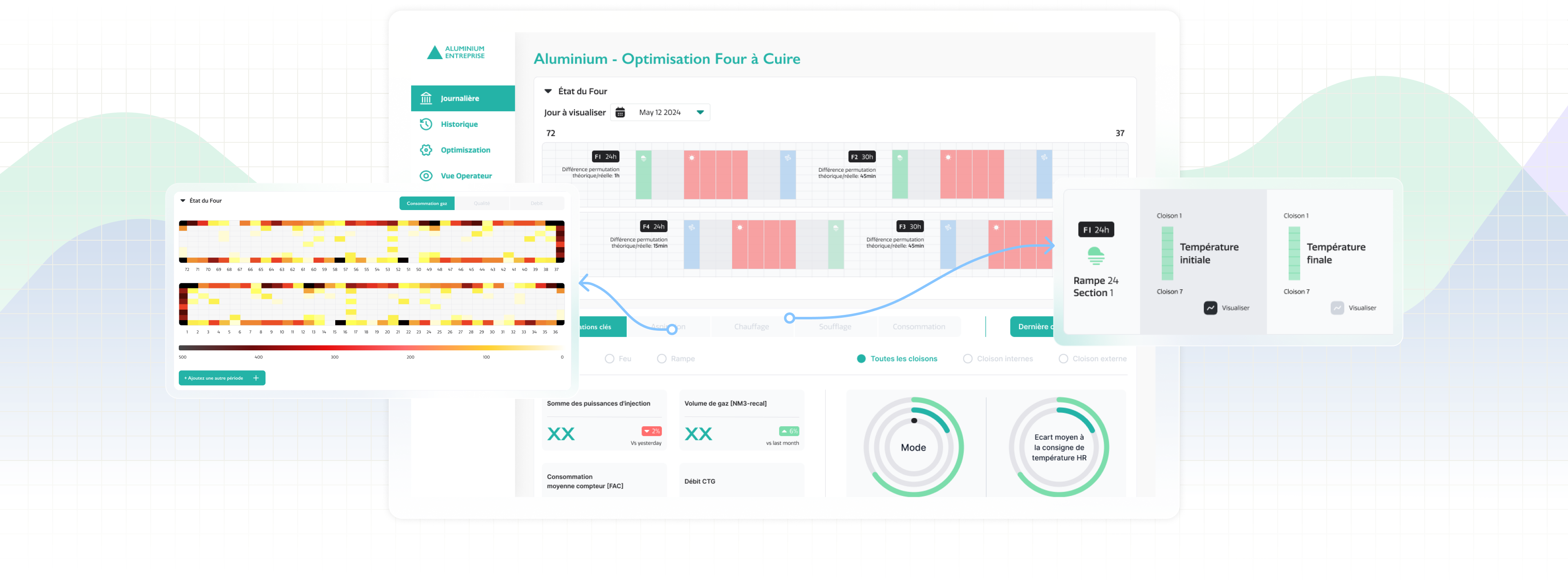
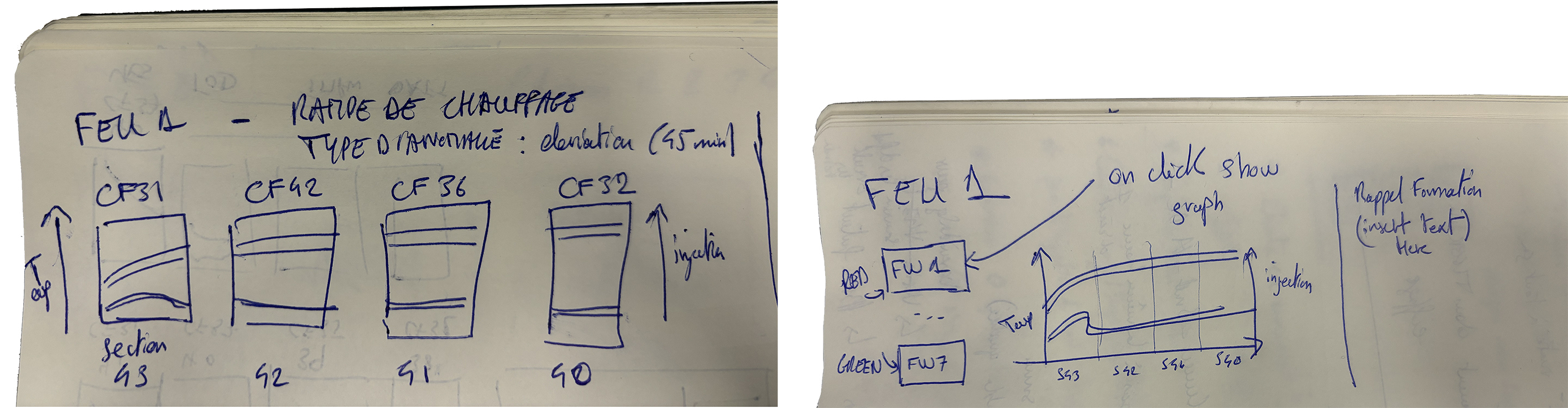
Project type: Industrial Oven Dashboard
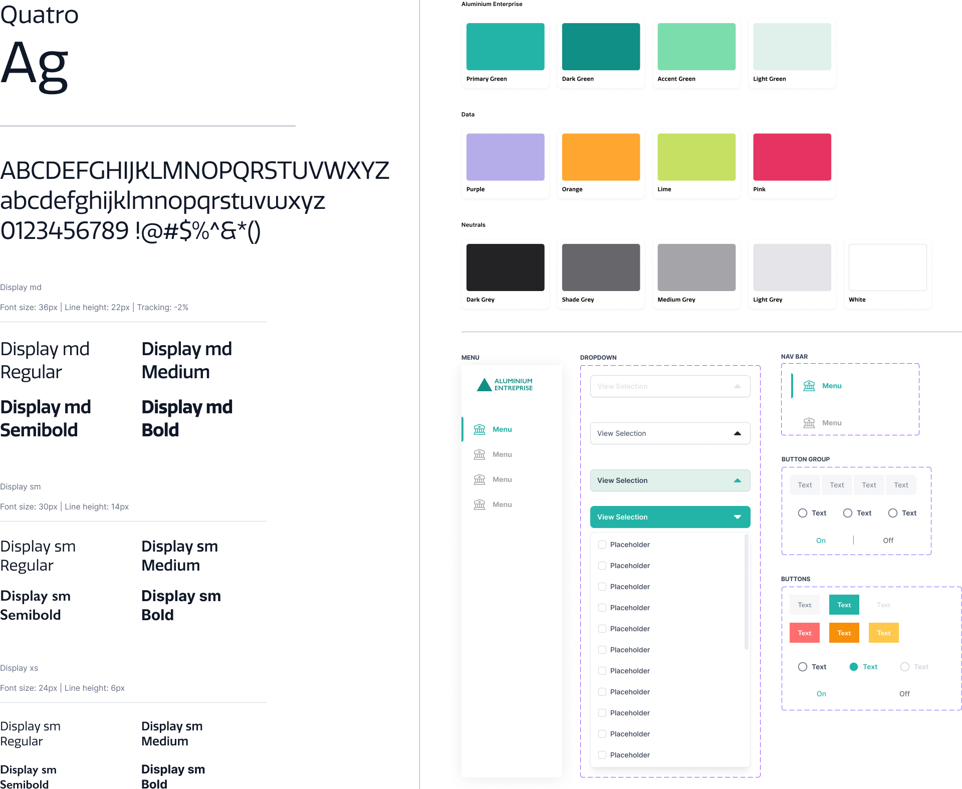
Role: Sole UX/UI Designer (collaborated with case team & data scientist)
Industry: Industrial
Tools: Figma, FigJam, Zoom, PowerPoint
Duration: Q3 2024 (3 months)
The Problem
Operators lacked a data-driven way to monitor oven performance or know when to adjust suction, heat, airflow, or consumption. Without visual data, they couldn’t spot trends, compare adjustments, or make informed decisions—leading to inefficiencies. Logging actions manually meant unclear accountability.
Research & Workshop
Through interviews and workshops with the client and case team, we synthesized findings into core pain points:
Insights & Painpoints
During a Zoom session, we reviewed the results, discussed the key statements, and translated the insights into clear pain points.
Messy manual logs restrict pattern recognition and collaborative sharing.
No easy way to filter or compare performance—operators can’t dynamically view data by date or event.
Data overload without visual context makes prioritizing actions difficult; numerical data alone doesn’t guide decision-making.
How Might We
We reframed each pain point into design potential
Design Goals & Decisions
Once how might we were established we evolved them into Design Goals and Design Decisions (how we solved it in the prototype).
1. Visibility & Feedback
Goal: Provide operators with clear visibility of how changes affect oven performance.

Decision: Introduced ghost lines on charts to compare historical runs with current adjustments.
2. Lack of Visualisation
Goal: Provide intuitive visuals for quick decision-making.

Decision: Incorporated line graphs and heatmaps to highlight performance shifts visually.
3. Time-Based Tracking
Goal: Enable quick and flexible navigation through past and current data.

Decision: Added a calendar selector with a “Today” quick-jump option for fast filtering.
Wireframes
The wireframes provided structure for early ideas and helped align with the client. They demonstrated how performance data could be transformed into actionable insights.
1. Added graphs to visualize operator activity and performance over time.
2. Explored layouts for quick comparison between oven settings (suction, heat, airflow, consumption).
3. Sketched potential navigation patterns to streamline filtering and daily monitoring.
Process
Information Architecture
Collaborated with a data scientist to structure the data model and interface hierarchy. Defined how metrics like suction, heat, and airflow would be visualized and prioritized.
Interface + UI Design
Created wireframes and early interface concepts focused on clarity. Brand identity into a scalable UI, focusing on clarity, accessibility, and user flow.
Design System
Built a modular design system with reusable components, interaction states.
Prototyping
Designed interactive prototype to test to gather feedback and refine components and layouts.
Design System
Solution
The final design brought clarity to complex oven operations by translating raw data into simple, actionable visuals:
Visual insights at a glance
Defined the visualisation approach for each key metric—suction, heat, airflow, and energy consumption—using tailored formats like gauges, trend graphs, and real-time indicators to support quick, informed decision-making by operators.
Userflow - Daily
Dynamic performance dashboard — operators can track suction, heat, airflow, and consumption in real time.
Userflow - Historical
Historical comparisons — ghost lines overlay past runs on charts to highlight the effect of adjustments.
Userflow - Operator View
Intuitive navigation — a calendar filter with “Today” focus enables operators to quickly review relevant time periods.
Prototype
The interactive prototype, built in Figma, brought the solution to life by simulating real operator flows. This allowed the client and case team to:
  • Test navigation and filtering interactions live on Zoom.
  • Validate the clarity of data visualization with non-design stakeholders.
  • Provide rapid feedback, enabling design refinements in real time.
Limitations & Constraints
Limitations I faced and how I resolved them.
Client confidentiality
I was onboarded through photos, process notes, and user interviews captured by the main case team, which we synthesised into insights and design requirements.
Language barrier
I used AI tools to translate Figma comments when the case team was unavailable, and validated critical points with bilingual colleagues to ensure accuracy.
Real-time iteration
I made live Figma changes and demonstrated interaction flows directly in Zoom sessions, which improved efficiency and reduced ambiguity in feedback.
Remote collaboration
I relied live sessions on Figma co-editing to ensure alignment.The entire project was conducted remotely, with all correspondence via Zoom. This made quick alignment and rapport harder to achieve.